Introduction to Data Visualization
Data visualization is a critical skill for any data scientist. It allows us to explore, understand, and communicate insights from complex datasets. Python offers powerful libraries like Matplotlib and Seaborn to create a wide range of static, interactive, and animated visualizations.
Why Visualize Data?
- Identify trends and patterns
- Detect outliers and anomalies
- Understand relationships between variables
- Communicate findings effectively
- Build compelling data stories
Key Libraries: Matplotlib & Seaborn
Matplotlib is the foundational plotting library in Python, providing a great deal of control over every aspect of a figure. Seaborn is built on top of Matplotlib and provides a high-level interface for drawing attractive and informative statistical graphics.
Getting Started with Matplotlib
Matplotlib allows you to create various plot types, from simple line plots to complex scatter plots and histograms.
Basic Plotting
Here's a simple example of creating a line plot:
import matplotlib.pyplot as plt
import numpy as np

# Sample data
x = np.linspace(0, 10, 100)
y = np.sin(x)

# Create the plot
plt.figure(figsize=(10, 6))
plt.plot(x, y, label='Sine Wave', color='dodgerblue', linewidth=2)

# Add labels and title
plt.xlabel('X-axis')
plt.ylabel('Y-axis')
plt.title('Simple Sine Wave Plot')
plt.legend()
plt.grid(True, linestyle='--', alpha=0.6)

# Display the plot
plt.show()
Customization
You can customize various elements like colors, line styles, markers, and labels to make your plots more informative.
Common Plot Types
- Line Plot
- Scatter Plot
- Bar Chart
- Histogram
- Pie Chart
- Box Plot
Exploring with Seaborn
Seaborn simplifies the creation of aesthetically pleasing and informative statistical graphics.
Statistical Plotting
Seaborn excels at visualizing relationships and distributions within data.
import seaborn as sns
import matplotlib.pyplot as plt
import pandas as pd

# Load a sample dataset (e.g., Tips dataset)
tips = sns.load_dataset("tips")

# Create a scatter plot with regression line
plt.figure(figsize=(10, 6))
sns.regplot(x="total_bill", y="tip", data=tips, scatter_kws={'alpha':0.6}, line_kws={"color": "red"})

plt.title('Tip vs. Total Bill')
plt.xlabel('Total Bill Amount ($)')
plt.ylabel('Tip Amount ($)')
plt.grid(True, linestyle='--', alpha=0.6)
plt.show()
Visualizing Distributions
Seaborn makes it easy to visualize the distribution of your data:
import seaborn as sns
import matplotlib.pyplot as plt

# Load a sample dataset
iris = sns.load_dataset("iris")

# Create a histogram of sepal length for each species
plt.figure(figsize=(10, 6))
sns.histplot(data=iris, x="sepal_length", hue="species", kde=True, palette="viridis")

plt.title('Distribution of Sepal Length by Species')
plt.xlabel('Sepal Length (cm)')
plt.ylabel('Frequency')
plt.show()
Advanced Plotting
Seaborn offers advanced plots like violin plots, heatmaps, pair plots, and FacetGrids for complex data exploration.
Gallery of Visualizations
Explore some common and impactful visualizations you can create:

Line Plot
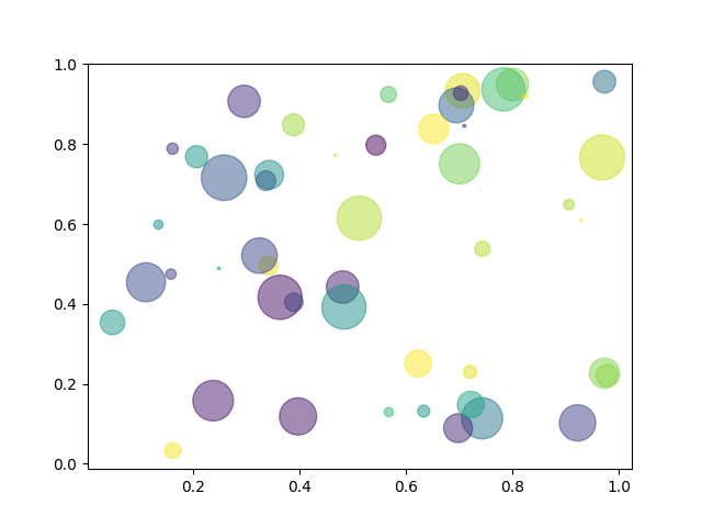
Scatter Plot

Histogram

Bar Plot

Box Plot

Heatmap